“Content hierarchy should be determined by user data”
Vancouver, June 5th, 2019
Major Tom, a leading digital agency based in the US and Canada, has been developing innovative websites for several years.
However, having what it takes to provide clients with website that are noticed and deliver what its audience is after, is not always easy.
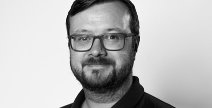
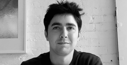
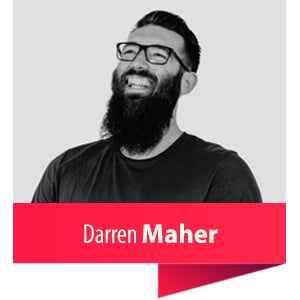
We spoke to Major Tom’s Ben Van Exan, Senior Account Manager and Darren Maher, Creative Director, to get the inside track on web design.
Darren has been with Major Tom for five years now. The 32-year-old studied Multimedia Applications Development in Ireland.
Originally from Kelowna, Ben is a 35-year-old with ten years of experience in marketing, three of which he has spent at Major Tom.

Could you tell us, in your opinion, what is the secret sauce to having a great web design?
Darren: Simplicity. The truth is, people don’t want to be on your website. Great website design doesn’t require the user to think too hard. Contrary to what a lot of companies tend to do, the fewer options the user has, the more likely they are to follow a well-thought flow from first landing on the site through to conversion. If a user is required to think too hard, they can get frustrated and either close the tab or worse – go directly to your competitor’s website.
Aesthetically, an excellent site design doesn’t draw attention to unnecessary clutter. Adding a bunch of design elements just for the sake of trying to make something “pop” is bad practice.
In most cases, the best web design is one that draws the user’s focus to the essential things: either the content, product/service offerings, or straight to a conversion path. If the design detracts from any of the user’s objectives, it won’t perform well.
Can you walk me through your design/development processes?
Ben: Before we can talk about design, we have to talk about User Experience (UX). And before we can talk about UX, we have to understand the website’s users, the business objectives, and the brand.
Once we have a solid understanding of these three areas, the UX team can start to plan the structure of the site (Wireframes). Just like a house would never be built without a blueprint, a good website is never designed before the wireframes have been built. There’s an awful lot of work that goes into a successful website project before the designs are even started.
Do you always offer web design and development services hand in hand?
Ben: No, not always. Some companies would instead use their own development team to build and manage the site long term. In those cases, we ensure that our designs are accompanied by a carefully detailed list of Functional Requirements that can be used by any development team to ensure consistency and keep the integrity of the designs intact.
What’s your research process like when you get a new project?
Darren: Our research process for new projects varies depending on how much the client knows about its audience and how internally aligned their team is. If the client has a good grasp of their users’ demographics, motivations, and use habits, as well as a solid business plan and brand, then we can move directly into the strategic plan for the site.
If the client isn’t fully aligned, or they don’t have data on their user’s behaviour, we may need to do some additional User Research, or a Branding Workshop – especially if we feel the brand isn’t cohesive or lacks impact.
User Research could be interviews, surveys, in-person user testing, parsing through analytics or combination of any number of research techniques that will help us avoid having to make assumptions about the user’s behaviour.
The research we do for a client’s website users can be incredibly valuable – it can be applied to other areas of the business, in marketing, new business acquisition, or even recruitment, growth strategy, etc.
It’s critical for us to make decisions based on data, not on assumptions, even if that means telling a client that what they think they know is wrong or out-dated. We research to answer questions and challenge assumptions.
How do you organise and prioritise your workload?
Ben: We tend to resource the UX, creative, and development teams at least a week in advance. Every Friday afternoon, we sit in a room and ensure we have prioritised the right project work with the right people for the following week. It’s not an exact science and critical issues always get thrown into the mix, but we keep pretty well organised and balanced by leaving room to be agile and avoiding overpromising on timelines.
I have two lists of tasks that I review and revise every morning. I have a list of things I need to do, and a list of things my team is doing. I’m a list maker – there’s something very satisfying to me when I can cross stuff off a list or put a big check mark on something.
How do you define a successful content hierarchy?
Darren: Start by asking:
• Is this content critical/useful to the user?
• Does it meet SEO best practice in terms of length and keyword density?
• Is it written well and with clarity?
• Does its placement on the page work well with all use-cases and user flows?
Content is the area where the vast majority of assumptions are made, to the detriment of the user (and ultimately the business).
Senior Leadership tends to think their users will want to read their bios. And HR managers believe “careers” should be in the main navigation. In truth, these are almost always assumptions that end up diluting the valuable content and messaging. It’s not that this content isn’t important, but the placement is what really matters. Ensuring the right content is in front of the user at the right time is what’s important.
The content hierarchy should be determined by user data, and never by the client’s assumptions. That’s why User Research and a well-thought Information Architecture is so critically important.
Could you tell us about a case study of web design that was particularly successful?
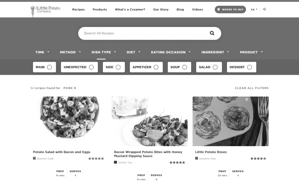
Ben: The Little Potato Company website project is a great example. Taking a minimalistic approach to the look/feel of the site allows the content to shine. One of the main objectives of the site was to promote the Recipe Centre. The design of the website enables the recipe content to be front and centre. Great images, lots of whitespace, and a strategic font hierarchy all contribute to optimal user experience for this type of website.
The development of this site was also particularly successful, mainly because every functional detail had been planned out and approved by the client before a single line of code was written.
Suppose that a client is upset with a particular element of design that you have done. They believe that you have not created what they asked for. How would you handle this?
Darren: Design is very subjective. Site design is where we can get stuck the easiest. Clients typically have an idea of what they want to see but are not always great at communicating it. It’s more like “I’ll know it when I see it, but it’s not this”, which isn’t very constructive for us.
I tend to pre-empt every design presentation by asking my clients to suspend their expectations until they have seen the ENTIRE site, and had at least a day or two to let it all sink in. It’s also essential to always remind clients that the site isn’t for them – it’s for their users.
We usually allow for a few rounds of feedback, depending on budget. If a client doesn’t like a particular element of design and can provide a good reason, then we will always offer some alternative ideas. But without a good reason, their opinion is just subjective, and it doesn’t come with the experience that our designers have.
Can you please share three things you love and three that you would do without in your job?
Ben:
Love: the people; getting to work with a variety of types of work, as well as clients/industries; celebrating with client teams after a big site launch.
Do without: clients who use bullying tactics to get what they want; projects with really short timelines; subjective design feedback without rationale.
What do you like to do in your spare time?
Ben: I’m a curler, squash-player, snowboarder, runner, classical pianist, barbershop quartet singer, Game of Thrones enthusiast.
Darren: work out, play video games, cook.
Thanks Ben and Darren!
By Geny Caloisi.
genyc@topinteractiveagencies.com
Follow Ben Van Exan on social media:
LinkedIn
Follow Darren Maher on social media:
LinkedIn
Follow Major Tom on social media:
Facebook
Twitter
Instagram
LinkedIn
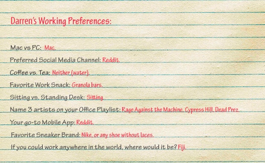
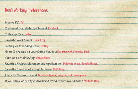
Darren’s Working Preferences:
Mac vs PC:
Mac
Preferred social media channel:
Reddit
Coffee vs. tea:
Neither (water)
Favorite work snack:
Granola bars
Sitting vs. standing desk:
Sitting
Name 3 artists on your office playlist:
Rage Against the Machine, Cypress Hill, Dead Prez
Your go-to mobile app:
Reddit
Favorite sneaker brand:
Nike, or any shoe without laces
If you could work anywhere in the world, where would it be?:
Fiji
Agency to watch
Best in Breed since 1998. Lounge Lizard is a Digital Agency that Specializes in Brand Strategy, Website Design, Web Development, Mobile APP Development, Online Marketing, Social Media, Ecommerce, and SEOdigital experiences that move brands and businesses from now to next.
Featured agencies
135040 Views
115591 Views
109358 Views
91841 Views

88321 Views

83116 Views
74743 Views

61550 Views